Showing posts with label Magazine Advert. Show all posts

Thursday, 1 December 2011

Final Magazine Advert

We have made further and final changes to our magazine advert. We decided to change the old green font to a white font with a black outline. This makes it more readable and stand out more. The green was too 'ugly' and 'slimy' and totally ruined our advert. Now it looks much more 'sleek' and professional. We didn't change much but we did decide to change the 'twitter' logo. We used to have the twitter logo with a blue background. Now we have got a much more modern and professional looking icon. It is just a 't' with a white outline and a transparent background. 

Friday, 11 November 2011

Updated Magazine Advert

We have once again amended our magazine advert! We have now changed the colour of our font. The artist name is now in blue while the album name is in green. This was due to the fact that our album is called 'Unorthodox' and wanted to reflect this in our theme. The artist name's colour is down to the fact he is called 'Iceburg', we wanted to reflect the name in the image by making it blue and look 'icy'. Our feedback stated that our icons on the bottom left were also too big and should be compressed further. We also changed the facebook and twitter part. Instead of having the whole URL for the facebook and twitter sites, we now have '/Iceburg' and '@Iceburg'. This was again from more album art research. We found that Ed Sheeran's '+''s magazine advert had just @EdSheeran and this change was inspired by our research. The feedback for this part has been positive as there's now less to read and therefore looks much more professional. The feedback received for our font colours have been mixed with some saying that it just doesn't go where as some have claimed they quite like the colour spectrum.

Thursday, 10 November 2011

Updated Magazine Advert

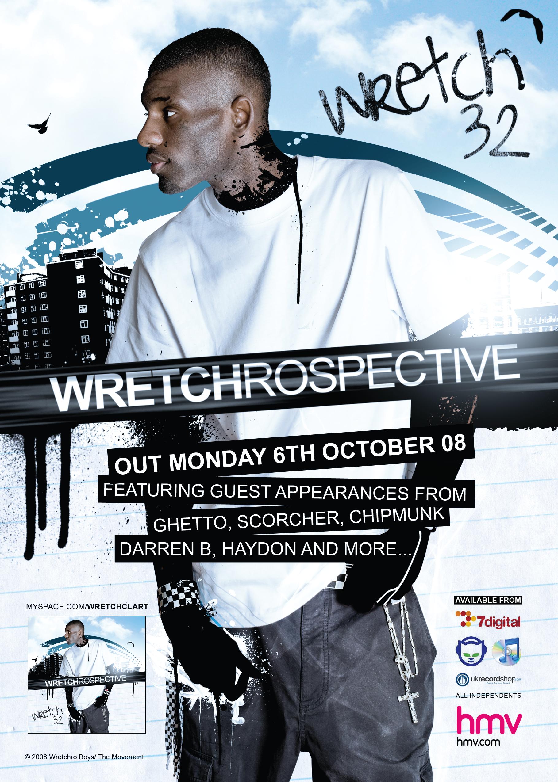
We decided to update our magazine advert. From the feedback we received that our initial advert looked 'unprofessional' we changed our font. We found the font using a website called www.1001freefonts.com, we were very lucky to find this website as it gave us a numerous amount of options we could use. We decided to go with this font as it went with our advert well and looked most professional for our needs. We moved the release date to the right side of the shot just below his bent knee. We moved it like this as people thought that the advert looked too 'cramped' and should be 'spaced out' more. Also, our icons at the bottom left of our advert have been shrunk in size and moved down lower towards the corner. This was because before it look like a 'child had done it' and that this way look more professional. Also, from our Album advert research similar artists like Wretch 32 had the icons towards the corner and were very small. We decided to remove the 'in stores' bit after the 'available' as it looked as if there was too much writing going on in the advert.

Wednesday, 9 November 2011

Rough Magazine Advert

This is our magazine advert which we created in our group. We followed a similar structure to that of Wretch 32's debut album as we feel that our artists are similar. We have included the artist name, album name, a release date, places you can buy it from and his twitter and facebook website links. We edited the photo on photoshop by giving the image a light blue mist about it. The fonts that we used were just rough and used any that looked appropriate from the options on photoshop. We thought it would be right to put the website information at the bottom of the advert as from the research we had been doing, most of the artists and labels websites were near or at the bottom.

We decided to put two places of purchase on our poster, them being HMV and iTunes, we thought as its his first studio album, it would be unlikely for our artist to be available at places such as Spotify yet.

The shot of our artist for the advert isn't the album cover, which in some instances we found that artists mostly use their album art for adverts and just elongate them so they can include all the relevant information. We did this as we want our audience to see our artist first. What he dresses like, what he looks like and what's his style. From his pose we can infer that he may be a little laid back about life and is still young and enjoying his time. We believe over time that our artist will mature and hopefully become more established therefore being able to use album arts and album adverts not featuring a shot of our artist at all.

Sunday, 6 November 2011

Magazine Advert


This magazine advert is of Wretch 32's first album called 'Wretchrospective'. The advert features where you can buy or download the album, a release date, featuring artists, the artist name, the artist name, a picture of the album cover with the artist. The advert also includes the myspace website of the artist and also features the name of the record label. Our magazine could be similar as this was the artists first studio album release, and follows quite a simple theme, with a silhouette background of a council estate which looks drawn by graffiti. It doesn't have any ratings or quotes, which you wouldn't expect on an artists debut album. My own magazine advert is done on paper and will be scanned in at a later time.